Explore other sample Line Graphs

The graph below shows US consumers’ average annual expenditures on cell phone - IELTS Writing Task 1
Technological developments often influence how consumers allocate their spending on communication services. The line graph for ‘The graph below shows US consumers’ average annual expenditures on cell phones’ reflects a shift in communication habits during this period. To achieve a Band 7+ score, you should focus on identifying the most significant trends and making clear comparisons between the two services, namely, cell phones and residential phones. This blog will examine three sample responses to the question ‘The graph below shows US consumers’ average annual expenditures on cell phone’, how to approach an IELTS Academic Writing Task 1 question based on a line...

7 min read
Updated On
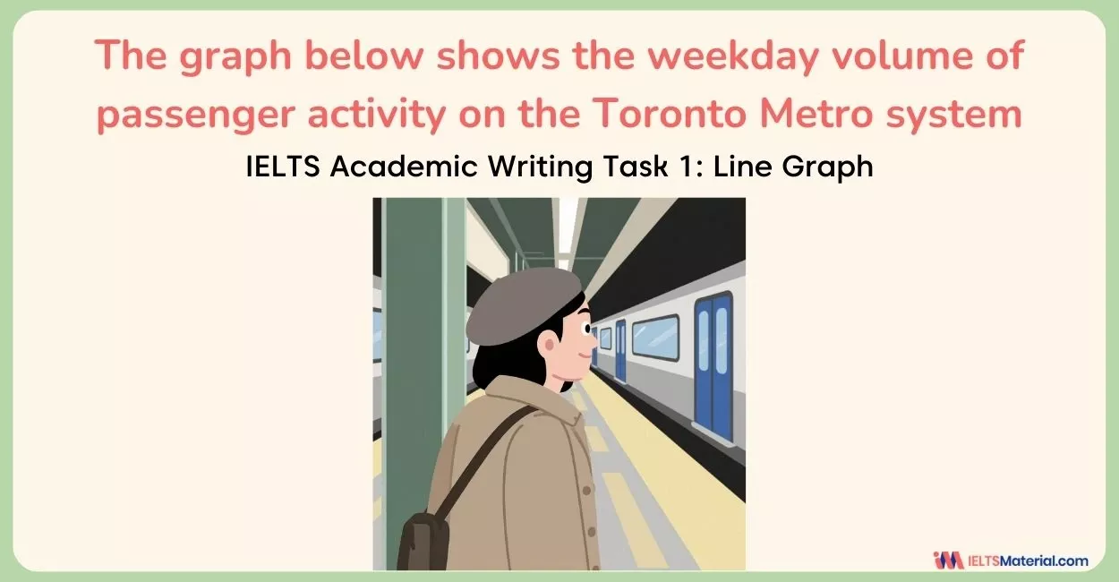
Weekday Volume of Passenger Activity on the Toronto Metro System - IELTS Writing Task 1 (Line Graph)
Urban transportation systems often experience predictable fluctuations in passenger demand during a typical working day. The line graph ‘The graph below shows the weekday volume of passenger activity on the Toronto metro system’ highlights how commuter traffic rises and falls at different times, particularly during rush hours. To achieve a Band 8+ score in IELTS Academic Writing Task 1, you must identify these peak travel periods and explain the overall daily pattern using clear comparisons and accurate trend vocabulary. In this blog, we will look at how to structure a question based on a line graph, three sample answers to 'Weekday...
7 min read
Updated On
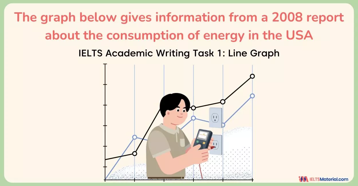
The graph below gives information from a 2008 report about the consumption of energy - IELTS Writing Task 1
The line graph ‘The graph below gives information from a 2008 report about the consumption of energy’ summarizes data from a 2008 report illustrating how different fuel sources have been used in the USA over a 50-year period, including future projections. Understanding how to identify dominant trends, stable patterns, and projected shifts is essential for producing a Band 8+ IELTS Writing Task 1 response. In this blog, we will look at how to approach an IELTS Academic Writing Task 1 question based on a line graph, three sample answers to 'The graph below gives information from a 2008 report about energy consumption',...
6 min read
Updated On

The Percentage of Female Members of Parliament in 5 European Countries - IELTS Academic Writing Task 1 (Line Graph)
The IELTS Academic Writing Task 1 often features line graphs, and one increasingly common theme is gender representation in politics, for example, the percentage of female members of parliament in 5 European countries. Understanding how to describe trends, comparisons, and significant changes is crucial for this type of task, especially if you want to score a 7+ band score. In this blog, we will examine how to approach a Task 1 question based on an IELTS Writing Task 1 line graph, 3 sample answers on ‘The Percentage of Female Members of Parliament in 5 European Countries’, and tips related to...
6 min read
Updated On
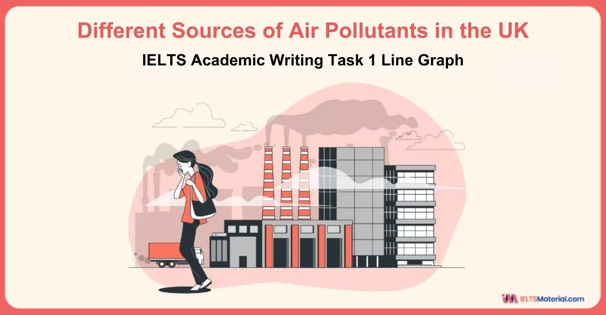
Different Sources of Air Pollutants in the UK - IELTS Academic Writing Task 1 Line Graph
The IELTS Academic Writing Task 1 topic, ‘Different Sources of Air Pollutants in the UK’, would help you to describe, explain, and compare the trends given in the line graph. You need to write your analysis systematically within 20 minutes. Even though the sample answers are provided, you must first try answering the questions yourself first. It is vital to incorporate a few tricks as you prepare yourself with the line graph from the IELTS Academic Writing Task 1. As you will encounter a visual representation, you must know how to discuss the precise data across different categories or time...
7 min read
Updated On
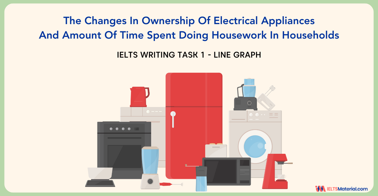
The Changes In Ownership Of Electrical Appliances And Amount Of Time Spent - IELTS Writing Task 1
In the IELTS Academic Writing Task 1, you are required to describe visual information, such as graphs, charts, or diagrams. One such example is the line graph titled ‘The Changes in Ownership of Electrical Appliances and Amount of Time Spent Doing Housework in Households’, which you must analyse and report on in a formal style. IELTS Writing Task 1 Line Graph are commonly featured in the IELTS exam and are used to show changes over time. They typically have two axes: the X-axis, which indicates the time period, and the Y-axis, which shows the quantity or percentage being measured. These graphs...
6 min read
Updated On

IELTS Academic Writing Task 1 – Shops that Closed
In the IELTS Academic Writing Task 1, you are often required to interpret and present information from charts, graphs like for the IELTS Academic Writing Task 1 – Shops that Closed. Mastering IELTS Writing Task 1 requires a strategic approach to interpreting data accurately and expressing findings coherently. By systematically analyzing the graph showing the number of closed shops and the number of new shops that opened in one country between 2011 and 2018, you can hone their skills in presenting complex information with clarity and precision. If you want to perfect your writing skills for Academic Writing Task 1, make sure...
7 min read
Updated On

IELTS Academic Writing Task 1 Topic : International conferences in three capital cities – Line Graph
Task 1: International conferences in 3 cities (line)The graph shows the information about international conferences in three capital cities in 1980 – 2010Report Plan Paraphrase: Illustrate the comparison of conferences between 1980 and 2010 in 3 cities. Overview/summary paragraph: (1) contrast rapid increase in the figures for City C (2) the number of conferences declined in Cities A and B. Paragraph 3: City A and City B: compare 1980 numbers; give figures for 2005, when both cities hosted the same number of international conferences; compare final numbers in 2010. Paragraph 4: contrast City c trend and numbers; giving figures for...
2 min read
Updated On
IELTS Academic Writing Task 1 Topic: Price changes for fresh fruits and vegetables – Line Graph
The graph below shows relative price changes for fresh fruits and vegetables, sugars and sweets, and carbonated drinks between 1978 and 2009.Summarise the information by selecting and reporting the main features, and make comparisons where relevant.Write at least 150 words. Report Plan Paraphrase: shows>provides information; price changes for>changes in the price of Overview: The line graph provides information about changes in price of three different food product groups in the USA from 1979 to 2009. Paragraph 2: (1) Talk about the overall picture. Give a gist of the graph. Paragraph 3: (1) Talk about price changes. Give figures. Paragraph 4:...
2 min read
Updated On

IELTS Academic Writing Task 1 Topic : Percentage of Car Ownership in Great Britain – Line Graph
Describe Image is one of the most complicated tasks in the IELTS Writing module. Without a sound plan, it can be difficult to perform well on the Describe Image exercise. The Line Graph is the ideal format for practising the Describe Image problem because it has logically and simply organised all of the components. Elements of the Line Graph include the title, the legend, the X-Axis, and the Y-Axis. Percentage of car ownership in Great Britain according to household. Report Plan Paraphrase: percentage of car ownership>proportions of car owned; Overview: The graph demonstrates the proportion of cars owned by household...
2 min read
Updated On

