Explore other sample Tables

Sales at a Small Restaurant in a Downtown Business District - IELTS Writing Task 1 Table
As there are different types of diagrams and graphs in the IELTS Writing Task 1, it is necessary to practice each of them such as ‘Sales at a Small Restaurant in a Downtown Business District’. Even though the figures might seem difficult to analyse, you can approach the question effectively with the right approach. In this topic, you need to make comparisons and analyze the data provided with appropriate vocabulary words within 20 minutes. By diving into the sample answers of this IELTS Writing topic, you will elevate your confidence level and answer coherently during the actual exam. Question -...

4 min read
Updated On
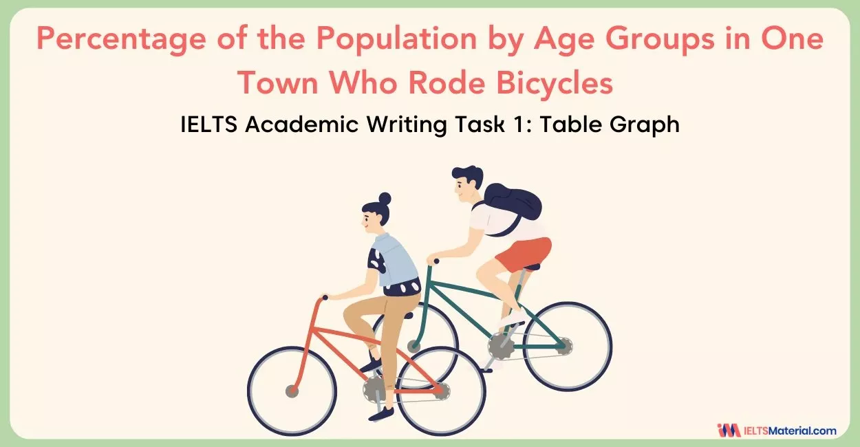
The table below shows the percentage of the population by age groups - IELTS Writing Task 1
In IELTS Writing Task 1, candidates are often presented with visuals like table graphs. They require you to compare numerical data, identify trends, and highlight significant differences, just like in the topic, ‘The table shows the percentage of the population by age groups in one town who rode bicycles in 2011’. Your task is to describe the data clearly and objectively, without inserting personal opinions. In this blog, we will examine how to approach an IELTS Academic Writing Task 1 question based on a table graph, 3 sample answers on ‘The table below shows the percentage of the population by age groups’,...
6 min read
Updated On

IELTS Writing Task 1 Table : Information About Underground Railway Systems in Six Cities
In the IELTS Academic Writing Task 1, candidates are often presented with a question that will showcase a table like the ‘IELTS Writing Task 1 Table : Information About Underground Railway Systems in Six Cities’. In order to describe a table, you need to compare and contrast the data that is given. While writing, we need to ensure the table chart vocabulary and that it is unique and engaging for which you need to prepare yourself by incorporating a few strategies. As there is a lot of information, you need to first analyze the exact data so that you can...
7 min read
Updated On

IELTS Writing Task 1 Table - Changes in Modes of Travel in England
Describing any visual representation is one of the most complicated tasks in the IELTS Academic Writing Task 1. One of the types of questions would be tables which are used to display text, numbers, or symbols—or a combination of these—in columns or boxes such as the IELTS Writing Task 1 Table - Changes in Modes of Travel in England. You are required to show a group of facts and their connections by summarizing the main information and making comparisons. The purpose of IELTS Writing Task 1 Table - Changes in Modes of Travel in England is to develop the ability to...
6 min read
Updated On

IELTS Academic Writing Task 1 Topic : Amount of money given in aid of developing countries – Table
The table shows the amount of money given in aid of developing countries’ technology by charities in the US, EU, and other countries from 2006 to 2010. Report Plan Paraphrase: illustrates; the amount of money>how much money; given>donated; from 2006 to 2010>in the period 2006 to 2010. Summary/overview paragraph: (1) total aid increased (2) US charities gave most money. Paragraph 3: the trend for total aid; share of total aid from US charities. Paragraph 4: compare trends for aid from the EU and other countries. Sample Answer The table illustrates the total amount of donations made by the US, UK,...
2 min read
Updated On

IELTS Academic Writing Task 1 Topic 15: Average length of YouTube video advertisements – Table
The table shows the average length of YouTube video advertisements and an average length of time viewers spend watching them. Summarise the information by selecting and reporting the main features. Write at least 150 words. Average YouTube Video ad length and time viewed Type of YouTube ad The average length of YouTube ad (seconds) Average time viewed(seconds) Public service 66.7 28.1 Business and finance 35.1 24.6 Entertainment and news 30.8 26.5 Travel 28.7 23.0 Technology 39.3 20.9 Retail 26.5 20.1 Consumer electronics 24.9 17.3 Clothing 23.4 16.6 Pharmaceuticals 21.8 16.0 Lifestyle 33.7 14.3 Overall 38.1 20.4 Report Plan Paraphrase: depicts;...
2 min read
Updated On

IELTS Academic Writing Task 1 Topic 39: Alcohol related deaths 2005 and average beer consumption – Table
Summarise the information by selecting and reporting description of the correlation of the table that follow.Write at least 150 words. Report Plan Paraphrase: correlation of the table >the table shows a clear correlation Overview: The table shows a clear correlation between the litres of beer consumed per capita and the number of alcohol-related deaths. Paragraph 2: (1) Compare the alcohol-consumption statistics and the death rates in given countries. Give figures. Paragraph 3: (1) Compare the alcohol-consumption statistics and the death rates in given countries. Give figures. Sample Answer The table shows a clear correlation between the litres of beer consumed...
2 min read
Updated On

IELTS Academic Writing Task 1 Topic 35: Number of travelers using three major German airports – Table
You should spend about 20 minutes on this task.The table below highlights data on the number of travelers using three major German airports between 2007 and 2012. Summarize the information by selecting and reporting the main features, and make comparisons where relevant.Write at least 150 words. Airport visitors, 2007-2012 (millions of travelers per year) Report Plan Paraphrase: highlights data>shows information; on the number of travelers using three major German airports>about how many people visited Germany through three major airports Overview: The table highlights data on the number of travelers using three major German airports. Paragraph 2: (1) Give the gist...
2 min read
Updated On

IELTS Academic Writing Task 1 Topic 16: Journeys made by different forms of transport in four countries. – Table
The table shows the percentage of journeys made by different forms of transport in four countries, The bar graph shows the results of a survey into car use. Summarise the information by selecting and reporting the main features, and make comparisons where relevant. Write at least 150 words. Journeys made by Canada Belgium Germany Netherlands Car 90% 72% 68% 47% Bicycle 1% 2% 2% 26% Public transport 3% 12% 18% 8% On foot 5% 11% 11% 18% Other 1% 3% 1% 1% Report Plan Paraphrase: shows>helps compare; journeys made by different forms of transport>modes of transport used Overview: The table...
2 min read
Updated On

IELTS Academic Writing Task 1 Topic 07: The worldwide market share of the mobile phone market for manufactures – Table
You should spend about 20 minutes on this task. The table shows the worldwide market share of the mobile phone market for manufactures in the years 2005 and 2006. Summarise the information by selecting and reporting the main features, and make comparisons where relevant. Write at least 150 words. Worldwide Mobile phone Sales in 2005 & 2006 (% share of market) Company 2005 % Market share 2006 % Market share Nokia 32.5 35 Motorola 17.7 21.1 Samsung 12.7 11.8 Sony Ericsson 6.3 7.4 L.G 6.7 6.3 BenQ Mobile 4.9 2.4 Others 19.2 16.2 TOTAL 100.0 100.0 Report Plan Paraphrase: shows>demonstrates;...
2 min read
Updated On

