Vocabulary for Accurate Data in Writing Task 1
Table of Contents

Limited-Time Offer : Access a FREE 10-Day IELTS Study Plan!
IELTS Academic Writing task 1 requires you to write a report in at least 150 words in response to a table, maps, charts, graphs, or any diagram that is given in the question within a time frame of 20 minutes. This task requires you to use various words to present the data given in graphs, pie charts, line graphs, maps, or processes. A high band score in your Academic IELTS writing task 1 depends on your ability to use correct vocabulary, present the key facts, compare and contrast data, and present the logical flow of the graph.
The examiner will evaluate your performance on the following 4 parameters listed below:
- Task Response
- Lexical Resource
- Coherence and Cohesion
- Grammatical Range and Accuracy
All the marking as mentioned above criteria individually contributes 25% to overall performance. Since both lexical resource and grammatical range contribute 25% to your overall score, you have to ameliorate your vocabulary to achieve a high band score.
Vocabulary for Accurate Data
Ensure that you use a variety of words to represent details accurately. For IELTS writing task 1, a lack of accuracy will reduce your score.
Let’s take the help of an example to understand how to give information accurately.
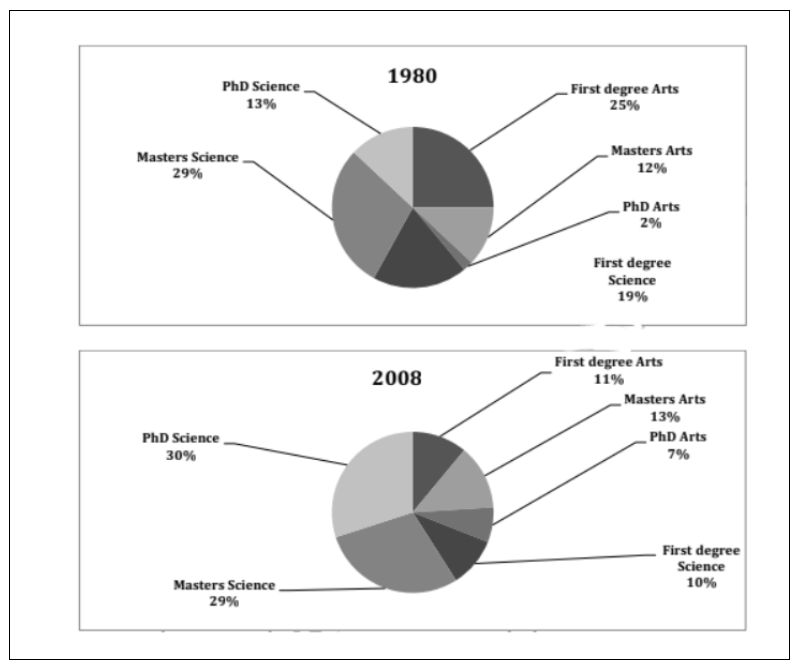
| Two pie charts show a comparison of the proportion of people with different degrees (first degree, master) and professions (Arts, science) who worked in an engineering company in 1980 and 2008. |

Here, in order to describe the details mentioned in the above pie chart.
“There was a significant increase in the number of PhD degree holders in Arts from approximately 2% in 1958 to about 7% in 2008.”
Or
“There was a about 5% increase in the number of PhD degree holders in Arts from 1958 to 2008.”
The adoVe mentioned sentences are incorrect because the pie chart clearly states that PhD degree holders in Arts rose exactly from 2% to 7%, not approximately or about.
The correct way of representing the information would be:
“There was a significant increase in the number of PhD degree holders in Arts from 2% in 1958 to 7% in 2008.”
Or
“There was a 5% increase in the number of PhD degree holders in Arts from 1958 to 2008.”
Let’s take a look at another example.

This is incorrect way of representing the information:
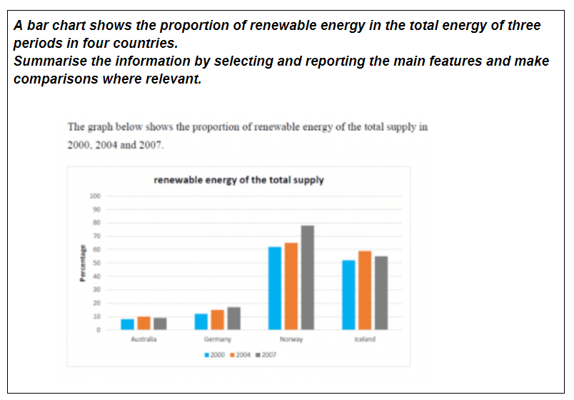
“In 2000, Norway had the highest renewable energy with 62%, followed by Iceland with only 10% less renewable energy.”
This is correct way of representing the information:
“Norway had the highest renewable energy in 2000, with approximately 62%, followed by Iceland, which had about 51% renewable energy.
In this question, the data is not given accurately. Hence you can decide based on the statistics given to you in the pie chart. That is why you can add words like approximately and about to describe the figures.
Learn synonyms and use them accurately in your writing task in order to show the examiner that you are aware of a good range of vocabulary.
Below is a list of helpful vocabulary that can assist you in accurately describing the data without having to repeat it.
Around
- Approximately
- About
Over
- Slightly over
- Marginally over
- Considerably more than
- Above
- More than
Less than
- Under
- Below
- Nearly
- Close to
- slightly less than
- Close to
- almost
Fractions
- 74% – nearly three quarter
- 47% – just under half
- 31% – nearly a third
- 50% – exactly a half
- 27% – roughly one quarter
- 48% – around a half
- 52% – just over a half
Proportions
- 85% – a large portion
- 72% – significant majority
- 12% – a small minority
Some other words
- Slight
- Steep
- Significant
- Considerable
- Rapid
- Moderate
- Sharp
- Dramatic
- Peak
- Increase
- Rise
- Slump
- Drop
- Dip decrease decline
- Fluctuation
Also Check:
Explore IELTS related articles

Start Preparing for IELTS: Get Your 10-Day Study Plan Today!
Recent Articles

Nehasri Ravishenbagam

Nehasri Ravishenbagam

Haniya Yashfeen


Post your Comments
1 Comment