Average Household Expenditures in a Country in 1950 and 2010- Pie Chart
2 min read
Updated On
-
Copy link
Curious about how to write answers for the IELTS Writing Academic topic "Average Household Expenditures in a Country in 1950 and 2010." Check out our comprehensive IELTS pie chart answers with report plan to craft your own answers!
Table of Contents

Try AI Essay Checker for Instant Band Score
An IELTS pie chart is a type of data visualization commonly used in IELTS Academic Writing Task 1. It represents information in the form of a circular chart divided into segments, each representing a proportion of the whole. In the IELTS Writing exam, you may be asked to describe, compare, and summarize the data shown in one or more pie charts. Your response should highlight key trends, differences, and overall patterns without inserting personal opinions.
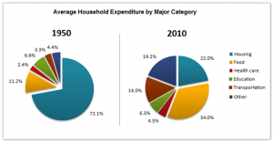
The pie charts below show the average household expenditures in a country in 1950 and 2010.
You should spend about 20 minutes on this task.
Summarize the information by selecting and reporting the main features, and make comparisons where relevant.
Write at least 150 words.

Report Plan
Paraphrase: Paraphrase the topic sentence.
Overview: Mention the main features of two pie charts and give an overview of the information provided.
Paragraph 1: Elaborate on the average household expenditure in a country in two different years. Make comparisons wherever necessary.
Paragraph 2: Elaborate on the average household expenditure in a country in two different years. Make comparisons wherever necessary.
Aspiring to Crack the IELTS Writing? Get expert help today with a FREE demo session! Sign up, Now!
Sample Answer
The two pie charts illustrate the major areas of household expenditure in a country in 1950 and 2010.
The major part of the average household expenses in this country in 1950 was that of housing expenses and other food, healthcare, education, etc. were relatively marginal expenses. In 2010, household spending was more balanced and costs of various amenities changed.
Housing expenses made up for 72.1% of the total household expenditure in this country in 1950 whereas it made up for only 22% of household spending in 2010. The expenditure on food increased from 11.2% in 1950 to 34% in 2010. Other major categories like healthcare, transportation and education contributed comparatively less to the overall household expenses in 1950.
Spending on areas like transportation and others was significantly higher in 2010 as compared to 1950. The expenditure on education was almost similar in both years with a marginal decrease in 2010.
Curious about your IELTS Writing score? Submit your IELTS Writing Essay for evaluation & get improvement tips!
Practice IELTS Writing Task 1 based on report types

Start Preparing for IELTS: Get Your 10-Day Study Plan Today!
Recent Articles

Nehasri Ravishenbagam

Nehasri Ravishenbagam

Kasturika Samanta


Post your Comments