How Energy is Used in an Average Australian Household - Pie Chart
4 min read
Updated On
-
Copy link
Explore how to describe pie charts in IELTS Writing Task 1 with an example comparing Australian household energy use and greenhouse gas emissions. Learn tips for clear analysis and accurate conclusions.
Table of Contents

Try AI Essay Checker for Instant Band Score
Describe Image is one of the most complicated tasks in the IELTS Writing module. Without a sound plan, it can be difficult to perform well on the Describe Image exercise. The Pie Chart is the ideal format for practising the Describe Image problem because it has logically and simply organised all of the components. Elements of the Bar Graph include the title, the data, the legend, and the number of pie slices.
The first chart below shows how energy is used in an average Australian household. The second chart shows the percentage of greenhouse gas emissions that result from this energy use.
Question
You are advised to spend about 20 minutes on this task.
Summarise the information by selecting and reporting the main features, and make comparisons where relevant.
You should write at least 150 words.
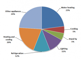
The percentage of household energy use in Australia:
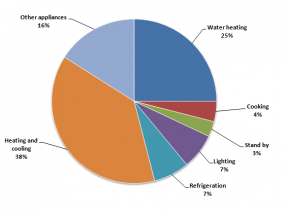
The percentage of greenhouse gas produced in Australia:
Report Plan
Paraphrase: Paraphrase the topic sentence.
Overview: Mention the main features of the two pie charts and give an overview of the information provided.
Paragraph 1: Elaborate on household energy use in Australia.
Paragraph 2: Elaborate on the production of greenhouse gases due to the energy use in Australia.
Learn the Best IELTS Writing Task 2 Tips for Achieving Band 9 Score!
How Energy is Used in an Average Australian Household - Sample Answer 1
The first pie chart represents the various categories of energy usage in Australian households. The second pie chart portrays the amount of greenhouse gas production due to household energy consumption in Australia.
The majority of energy in Australian households is consumed by water heating appliances, heating and cooling appliances and other household appliances. The highest amount of greenhouse gas emissions in Australia is due to heating and cooling appliances followed by water heating and other appliances.
The utilization of energy in Australian households is pretty balanced. Heating and cooling appliances, water heaters and other appliances contribute significantly to the total energy consumption. Refrigeration and lighting also add to the total expenditure followed by cooking appliances and standby energy consumption.
Greenhouse gases are primarily produced by heating and cooling appliances, water heaters and other appliances. Lighting and refrigeration both make up for 7% of greenhouse gas emissions respectively. Cooking appliances and standby energy expenditure also marginally contribute to greenhouse emissions.
How Energy is Used in an Average Australian Household - Sample Answer 2
The first pie chart illustrates the proportion of energy consumption across different categories in Australian households, while the second chart shows the percentage of greenhouse gas emissions resulting from this domestic energy use.
Overall, water heating, heating and cooling, and other appliances account for the largest share of household energy consumption. However, when it comes to greenhouse gas emissions, heating and cooling systems are the biggest contributors, followed closely by water heating and miscellaneous appliances.
In terms of energy usage, water heating represents the largest segment, with heating and cooling appliances ranking second. Other appliances also consume a substantial portion of energy. By contrast, refrigeration and lighting use comparatively smaller shares, and cooking as well as standby power account for the least energy consumption.
Regarding greenhouse gas production, heating and cooling systems generate the highest proportion of emissions. Water heating and other appliances also produce significant amounts. Although refrigeration and lighting consume moderate energy, they each contribute 7% to total emissions. Cooking appliances and standby energy use remain the smallest contributors overall.
Come learn proven tips for handling IELTS Writing in our Free IELTS Webinar!
How Energy is Used in an Average Australian Household - Sample Answer 3
The two pie charts compare household energy consumption in Australia with the proportion of greenhouse gas emissions produced by each category.
It is evident that most household energy is used for water heating, heating and cooling, and other appliances. Nevertheless, heating and cooling systems are responsible for the largest share of greenhouse gas emissions, slightly exceeding the proportion generated by water heating.
Looking more closely at energy use, water heating constitutes the greatest percentage of total consumption, followed by heating and cooling appliances. Other appliances also represent a notable share. In contrast, refrigeration and lighting account for smaller proportions, while cooking and standby energy use contribute the least.
In terms of emissions, heating and cooling appliances produce the highest level of greenhouse gases. Water heating and other appliances are also major contributors. Interestingly, refrigeration and lighting each account for 7% of emissions, despite consuming a smaller share of energy. Cooking and standby power generate only minimal emissions compared to the other categories.
Get help from IELTS Experts to Ace IELTS Writing Essays! Sign up for a FREE demo now!
In conclusion, the charts provide a clear overview of the data and allow for easy comparison between different categories. They highlight the main trends and relationships, making it easier to understand patterns and draw meaningful insights from the information presented.
Also check:
Practice IELTS Writing Task 1 based on report types

Start Preparing for IELTS: Get Your 10-Day Study Plan Today!

Recent Articles

Nehasri Ravishenbagam


Nehasri Ravishenbagam

Kasturika Samanta


Post your Comments