Demographic Trends in Scotland - Line Graph
4 min read
Updated On
-
Copy link
This guide examines the line graph “Demographic Trends in Scotland”, highlighting key trends, growth patterns, and population shifts. It provides tips and a clear framework for IELTS Writing Task 1 candidates to describe data accurately and coherently.

Table of Contents

Try AI Essay Checker for Instant Band Score
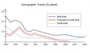
The line graph titled “Demographic Trends in Scotland” illustrates changes in population patterns over a specific period. In IELTS Writing Task 1, such line graphs are used to show trends, increases, decreases, or fluctuations in data over time. When describing this graph, it is important to paraphrase the title, identify key trends, and provide a concise overview of the main patterns without including excessive details. This introduction sets the stage for a clear, well-organized report that accurately interprets the demographic changes in Scotland.
Question
The figure shows demographic trends in Scotland.
You should spend about 20 minutes on this task.
Summarise the information by selecting and reporting the main feature.
You should write at least 150 words.
Report Plan
Paraphrase: Paraphrase the topic sentence using synonyms.
Overview: Mention the main features of the graph and give an overview of the information provided.
Paragraph 1: Elaborate on the demographic trends of Scotland.
Paragraph 2: Elaborate on the demographic trends of Scotland.
Learn the Best IELTS Writing Task 2 Tips for Achieving Band 9 Score!
Demographic Trends in Scotland - Sample Answer 1
The given line graph depicts the trends in the population of Scotland from 1940 to 2020. The parameters shown in this graph are the birth rate, population growth rate, and death rate of Scotland.
The birth rate, population growth rate, and death rate in Scotland have followed a downward trend. However, the mortality rate rose after 2010.
Both the birth rate and the death rate in Scotland were the highest in 1940. The birth rate followed a fluctuating pattern over the years with sharp rises around 1950 and 1970, after which it dropped. The population growth rate also declined overall, apart from a sudden increase between 1950 and 1960 and after which it finally fell to 0% after 2000.
The mortality rate in Scotland dropped from 1.5% in 1940 to somewhere below 0.5% around 1960, after which it remained relatively constant with a few decreases and eventually rose around 2010.
Demographic Trends in Scotland - Sample Answer 2
The line graph illustrates the trends in Scotland’s population between 1940 and 2020, focusing on the birth rate, population growth rate, and death rate.
Overall, all three parameters experienced a downward trend over the period, although the death rate increased slightly after 2010. The birth and death rates were highest in 1940, with the birth rate showing more fluctuations throughout the years.
Specifically, the birth rate fluctuated with noticeable peaks around 1950 and 1970 before declining steadily. The population growth rate also decreased over the period, except for a brief surge between 1950 and 1960, after which it gradually fell, reaching 0% by 2000. The death rate declined sharply from approximately 1.5% in 1940 to just below 0.5% by 1960 and remained relatively stable thereafter, although it rose slightly around 2010.
In summary, the line graph shows that Scotland experienced a steady decline in birth and population growth rates over the 80-year period, while the mortality rate generally decreased but exhibited a small upward trend in the last decade. These trends suggest significant demographic changes, reflecting improvements in healthcare and changes in societal behaviour over the years.
Come learn proven tips for handling IELTS Writing in our Free IELTS Webinar!
Demographic Trends in Scotland - Sample Answer 3
The line graph provides an overview of demographic trends in Scotland from 1940 to 2020, highlighting the birth rate, population growth rate, and death rate.
Overall, all three indicators showed a general decline during this period, with the death rate displaying a modest increase after 2010. The birth and death rates were initially the highest in 1940, while the population growth rate followed a broadly downward trajectory, punctuated by brief fluctuations.
In detail, the birth rate exhibited a fluctuating pattern, rising sharply around 1950 and again in 1970 before entering a sustained decline. The population growth rate mirrored this overall downward trend, except for a temporary spike between 1950 and 1960, eventually falling to 0% by the start of the 21st century. The death rate decreased markedly from roughly 1.5% in 1940 to below 0.5% by 1960 and remained relatively stable for the next decades, only to experience a slight increase after 2010.
In conclusion, the graph highlights a significant reduction in Scotland’s birth and growth rates over the eight decades, while the mortality rate remained low but slightly increased in the final decade. These patterns reflect both improvements in public health and changing social trends, offering insights into the long-term demographic evolution of the country.
Get help from IELTS Experts to Ace IELTS Writing Essays! Sign up for a FREE demo now!
In conclusion, the line graph on Demographic Trends in Scotland highlights significant shifts in population patterns over the given period. By analyzing the trends, it is clear which age groups or regions experienced growth or decline, providing valuable insights into Scotland’s demographic changes. Understanding these patterns is essential for planning resources, services, and policies to meet the needs of the population effectively. A clear and structured analysis, focusing on the main trends and comparisons, ensures a coherent and high-scoring IELTS Writing Task 1 report.
Also check:
Practice IELTS Writing Task 1 based on report types

Start Preparing for IELTS: Get Your 10-Day Study Plan Today!

Recent Articles

Nehasri Ravishenbagam


Nehasri Ravishenbagam

Kasturika Samanta


Post your Comments