IELTS Academic Writing Task 1 Topic 13: Percentage of housing owned and rented in the UK – Pie Chart
Updated On


Limited-Time Offer : Access a FREE 10-Day IELTS Study Plan!
Contents
Describe Image is one of the most complicated tasks in the IELTS Writing module. Without a sound plan, it can be difficult to perform well on the Describe Image exercise. The Pie Chart is the ideal format for practising the Describe Image problem because it has logically and simply organised all of the components. Elements of the Bar Graph include the title, the data, the legend, and the number of pie slices.
Write at least 150 words.
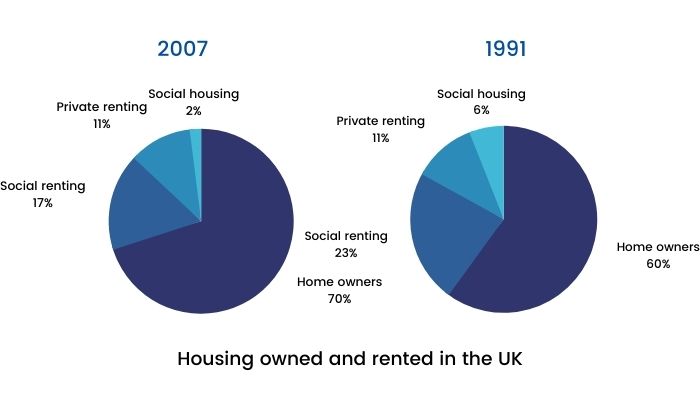
Housing owned and rented in the UK

Report Plan
Paraphrase: show>illustrate; the percentage of housing owned and rented in the UK>the comparability of homeownership and renting in the UK
Overview: The pie charts illustrate the comparability of homeownership and renting in two different years.
Paragraph 2: (1) Compare the percentages of different houses. Give figures.
Paragraph 3: (1) Compare the percentages of different houses. Give figures.
Sample Answer
The given pie charts illustrate the comparability of homeownership and renting in the UK in two different years, 1991 and 2007. In 1991, owning a house was the most popular housing type, accounting for 60%, or over half of the statistics. Social rented homes, amounting to 23% or nearly one-third of homes, turned out to be the next largest sector. The rest of the houses were typically privately rented (11%), with a tiny fraction being social housing (6%).
On the contrary, in 2007, the number of homeowners had upsurged to 70% or almost three-quarters of all homes. Most of the increase in homeownership can be explained by the decrease in social rented homes, which had dropped to 17%.
The percentage of houses privately rented stayed consistent and unchanged at 11%. However, compared to 1991, in 2007, there were 5 million more homes. From 1991 to 2007, the number of social housing had decreased three-fold from 6% to 2%, thereby being the least popular type of housing.
Get evaluated for FREE!
Got a quick report in your mind for this question. Don’t hesitate to post the same in our comment section. We will evaluate the report/letter and email you the band score & our trainer’s comments. And, this service is entirely free.
Also check:
- IELTS Writing Task 1
- IELTS Pie chart
- IELTS Bar chart
- IELTS Table chart
- IELTS Writing task 1 line graph
- IELTS Writing task 1 Map
- IELTS Writing task 1 tips
- IELTS Writing tips
- IELTS United Kingdom / IELTS UK
- IELTS Writing recent actual test
- IELTS Writing Answer sheet
- IELTS map vocabulary
- IELTS Writing Task 1 Connectors
Practice IELTS Writing Task 1 based on report types


Start Preparing for IELTS: Get Your 10-Day Study Plan Today!
Explore other sample Pie Charts

Recent Articles

Post your Comments
9 Comments
Kathy
Posted on Oct 26, 2023
The pie chart indicates the ratio of types of renting house and ownning home in United Kingdom in 2 different years, 1991 and 2007.
Overall, in both 2 years, owning a house is the most popular type of housing, accounting for 60% and 70%, respectively or over half of the statistics in both years while social housing is the least famous. The second largest sector is social rented home and other housing type contribute a tiny fraction in the total.
From 1991 to 2007, home owner’s percentage grew from 60 percent to 70 percent or approximately two-third. Homeownership is still the most famous after 16 years. While, private renting’s portion still remained the same at around one tenth after 16-year period. This means there was an increase in the number of private renting because social renting and social housing experienced a decrease.
In contrast, both percentage of social rented home and social housing decreased. Social renting dropped to 17% and by 8% according to a growth in the number of owning home. And social housing fell from 6% to 2%, still was the least popular housing type over 16 years.
Reply
IELTS Expert
Posted on Oct 28, 2023
Overall band: 5
Key features which are selected are covered and adequately highlighted. A relevant overview is attempted. Information is appropriately selected and supported using figures, but the sentences are not fluently linked to each other. Errors in grammar and punctuation are evident.
For more Tips and Tricks for writing, Unlock a free class.
Tarun Kanti Barua
Posted on Sep 13, 2023
I need some recent sample questions and answer sheets.
Best Regards
Tarun
Reply
ria mahajan
Posted on Oct 5, 2023
For practice material you can visit IELTSMaterial Store : https://store.ieltsmaterial.com/
For a Free 1:1 Demo session you can click on the following link
https://ieltsmaterial.com/signup-1/
or
you may reach out to us: +91 8929053019
Melda Salihoğlu
Posted on Aug 28, 2023
These two pie graphs illutrates the housing owned and rented in the UK from 1991 to 2007. There are various patterns of categories such as private renting , social renting , home owners and social housing.
Overall, they have approximately equal percentages for every same categories. Owning a house is the most prominent part of both side with 70% and 60% respectively. Whereas social housing is not very common section for these two charts therefore its rates are only 2% and 6% . While private renting remains its stability and has 11% between 1991 and 2007. On the other hand social renting is being the second place in both yet with different portions like 17% and 23%.
At a glance, there is a huge difference between owning a house and social housing relatively during this time. Nevertheless categories’ percentages kept their rates and rankings.
Reply
ria mahajan
Posted on Sep 1, 2023
BAND – 5.5
Errors in grammar and punctuation are present. A range of cohesive devices including reference and substitution should be used flexibly.
For further detailed evaluation . You can avail a Free trial class. Find the link below:
https://ieltsmaterial.com/signup-1/
dd
Posted on Jun 5, 2022
The pie charts compare the percentage of home owners and renters in the UK between 1991 and 2007.
Overall, it is noticeable that the highest percentage was in home buyers, whereas the lowest percentage was in social housing in the given period.
The number of home buyers was 60% of the total in 1991 in the UK, rising to 70% in 2007. The most significant increase held in home owners. Private renting, on the other hand, remained at 11% in both years.
While the proportion of ownership increased in 16 years, the proportion of two compounds (social renting and social housing) showed a dramatic declining trend. The highest fall was in the social renting, which was the second most crucial compound on the charts, almost a quarter of the total to only 17%. Although there was a significant loss between the years, social renting had still the second greatest rate in comparison with others. The number of social housing decreased from 6% to 2% in the UK.
Reply
Salar Agharahimi
Posted on Jan 31, 2022
The following report demonstrates the proportion of home ownership and renting in the UK in 1991 and 2007.
Overall, in both 1991 and 2007 the percentages of home owners and social housing were the most and the least respectively. The number of home owners saw an upward trend from 1991 to 2007, while the proportion of social renting and social housing decreased moderately. However, the private renting was the same in both years.
The percentage of people who owned a house increased from 60 percent in 1991 to nearly three quarters in 2007. In contrast, the number of those accommodated in social rented homes fell from 23 percent to 17 percent. The percentage of social housing residents was 6 percent in 1991 and dropped to only 2 percent in 2007. Unlike the other groups, the number of private renting residents witnessed no changes and constituted 11 percent of the population in 2007 as well as in 1991.
Reply
Janice Thompson
Posted on Feb 1, 2022
Band score: 5.5
Concentrate on the usage of articles.
Use “c2” vocabulary