IELTS Academic Writing Task 1 Topic 41: Employment patterns in the USA – Line Graph
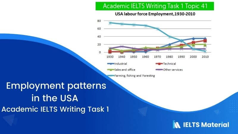
Table of Contents

Try AI Essay Checker for Instant Band Score
Summarise the information by selecting and report in the main features, and make comparisons where relevant.
Write at least 150 words.
Report Plan
Paraphrase: presents>represents; employment patterns in the USA >patterns of employment in America
Overview: The given graph represents the patterns of employment in America between the time period of 1930 and 2010.
Paragraph 2: (1) Talk about the employment patterns in different sectors. Give figures.
Paragraph 3: (1) Talk about the employment patterns in different sectors. Give figures.
Paragraph 4: (1) Talk about the employment patterns in different sectors. Give figures.
Sample Answer
The given graph represents the patterns of employment in America between the time period of 1930 and 2010.
It is evident that in 1930, 75% of the American labour force got employment in farming, fishing and foresting. On the other hand, merely 10% were employed in sales and office and trade. During this time, the industrial and technical sectors comprised only 2% of the workforce. However, a gradual change can be seen in the situation over the next 20 years, except for the technical workforce as it employed threefold people.
Also, by the time 1980 entered, the American employment pattern had undergone a substantial change. While the number of employees in farming, fishing and foresting had declined to 40%, industrial and technical employees saw an upsurge to 13% and 10% respectively.
Likewise, the sales and office sectors didn’t increase until 1980. The most significant change can be seen in 2000 when the proportions of farming, fishing and foresting decreased to 1% while the other three significant sectors increased to more than 20% of the employment.
Get evaluated for FREE!
Got a quick report in your mind for this question. Don’t hesitate to post the same in our comment section. We will evaluate the report/letter and email you the band score & our trainer’s comments. And, this service is entirely free.
Also check:
Practice IELTS Writing Task 1 based on report types

Start Preparing for IELTS: Get Your 10-Day Study Plan Today!

Recent Articles

Nehasri Ravishenbagam


Nehasri Ravishenbagam

Kasturika Samanta


Post your Comments
3 Comments