Explore other sample Bar Charts

Estimated World Illiteracy Rates by Region and by Gender – IELTS Writing Task 1 Bar Graph
The candidates for IELTS Academic Writing Task 1 are often presented with a bar chart like ‘Estimated World Illiteracy Rates by Region and by Gender’ on which you will be writing a report. Such a bar chart also comes with two axes, showing changes and diversifications over a given period. Furthermore, the bar graph has rectangular bars that could be either displayed vertically or horizontally, representing two or more values of data. Elements of the bar chart include the layout, the figures, the contrasts, and the similarities. With the questions on bar chart, hone your skills in describing, analyzing, and...

7 min read
Updated On
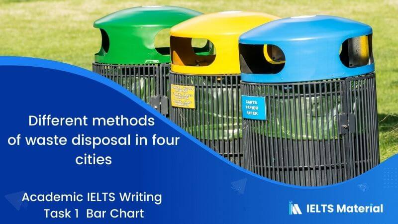
IELTS Academic Writing Task 1 Topic 11: Different methods of waste disposal in four cities – Bar Chart
Describing the Image is the task of the IELTS Writing Task 1 Academic. Without a sound plan, it can be difficult to perform well on the Describe Image exercise. The IELTS Bar Chart is the ideal format for practising the Describe Image problem because it has logically and simply organised all of the components. Elements of the Bar Chart include the layout, the figures, the contrasts, and the similarities. You should spend about 20 minutes on this task.The bar chart shows different methods of waste disposal in four cities; Toronto, Madrid, Kuala Lumpur and Amman. Summarize the information by describing...
3 min read
Updated On

USA Marriage and Divorce Rates Between 1970 and 2000 and the Marital Status of Adult Americans- Bar Graph
Describe Image is one of the most complicated tasks in the IELTS Writing module. Without a sound plan, it can be difficult to perform well on the Describe Image exercise. The Bar Graph is the ideal format for practising the Describe Image problem because it has logically and simply organised all of the components. Elements of the Bar Graph include the layout, the figures, the contrasts, and the similarities. The charts below give information about USA marriage and divorce rates between 1970 and 2000 and the marital status of adult Americans in two of the years. You should spend about...
2 min read
Updated On
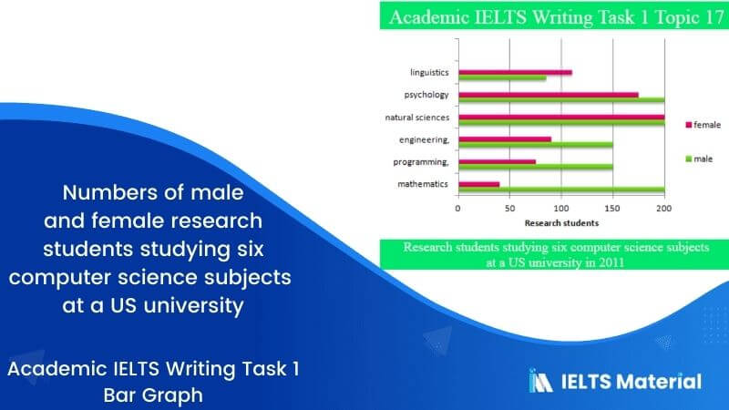
IELTS Academic Writing Task 1 Topic 17: Numbers of male and female research students studying six computer science subjects at a US university – Bar Graph
Describe Image is one of the most complicated tasks in the IELTS Writing module. Without a sound plan, it can be difficult to perform well on the Describe Image exercise. The Bar Graph is the ideal format for practising the Describe Image problem because it has logically and simply organised all of the components. Elements of the Bar Graph include the layout, the figures, the contrasts, and the similarities. The bar graph below shows the numbers of male and female research students studying six computer science subjects at a US university in 2011.Summarise the information by selecting and report in...
3 min read
Updated On
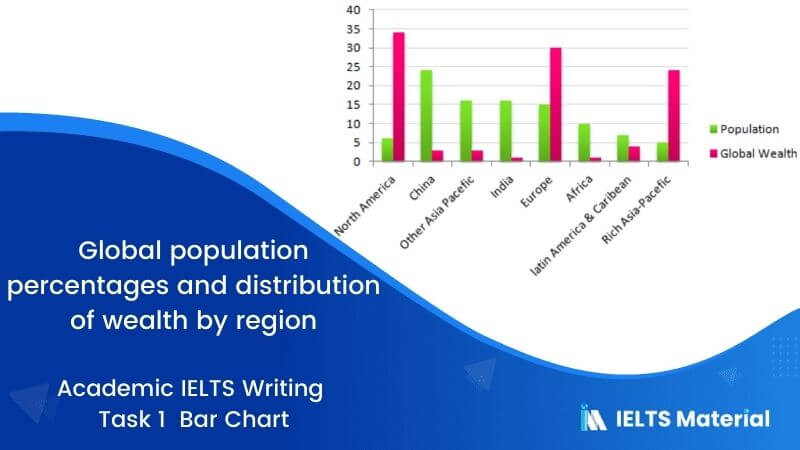
IELTS Academic Writing Task 1 Topic 06: Global population percentages and distribution of wealth – Bar chart
Describe Image is one of the most complicated tasks in the IELTS Writing module. Without a sound plan, it can be difficult to perform well on the Describe Image exercise. The Bar Graph is the ideal format for practising the Describe Image problem because it has logically and simply organised all of the components. Elements of the Bar Graph include the layout, the figures, the contrasts, and the similarities. You should spend about 20 minutes on this task.The chart below gives information about global population percentages and distribution of wealth by region. Summarise the information by selecting and reporting the...
2 min read
Updated On

IELTS Academic Writing Task 1 Topic : People affected by four types of noise pollution – Bar graph
In IELTS Writing Task 1 of the Academic section, there will be a visual representation or a diagram on which you have to write a paragraph. One of these visual representations may be bar graphs. Given below is an example of an IELTS Writing Task 1 bar graph discussing the number of people who are affected by four types of noise day on a daily basis in cities and rural areas in 2007. Let’s understand how to frame the essay from the ideas we have. The charts illustrate the number of people affected by four types of noise pollution day...
3 min read
Updated On
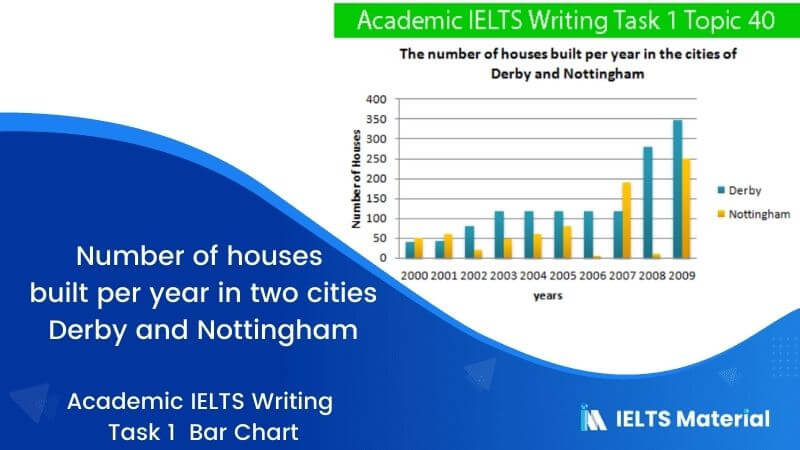
IELTS Academic Writing Task 1 Topic 40: Number of houses built per year in two cities Derby and Nottingham – Bar Chart
The bar chart below shows the number of houses built per year in two cities, Derby and Nottingham, Between 2000 and 2009.Write a report for a university lecturer describing the information shown below.Write at least 150 words. Report Plan Paraphrase: shows>outlines; number of houses built per year >number of houses constructed annually Overview: The bar graph outlines the drinking pattern of Americans based on their age groups. Paragraph 2: (1) compare the number throughout different periods. Give figures. Paragraph 3: (1) compare the number throughout different periods. Give figures. Sample Answer The given chart outlines the number of houses constructed...
2 min read
Updated On
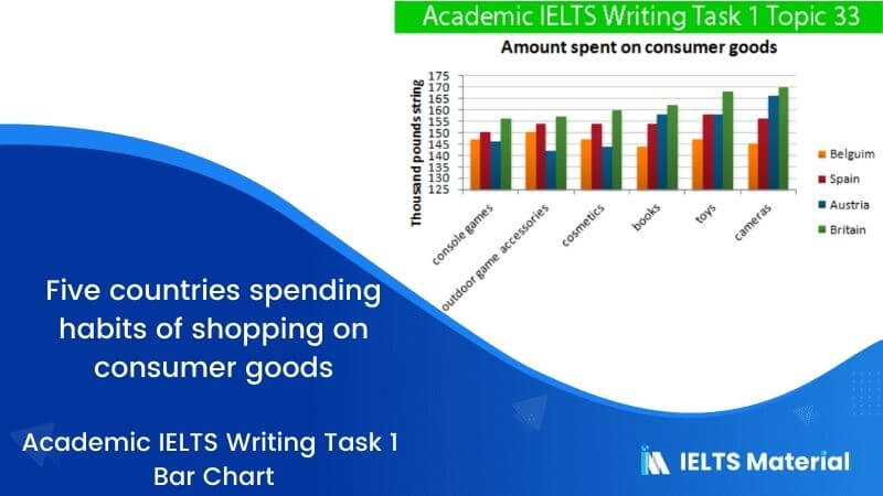
IELTS Academic Writing Task 1 Topic 33: Five countries spending habits of shopping on consumer goods – Bar Chart
The bar chart below gives information about five countries spending habits of shopping on consumer goods in 2012. Summarise the information by selecting and reporting the main features, and make comparisons where relevant.Write at least 150 words. Report Plan Paraphrase: gives information>depicts; spending habits >spending patterns Overview: This bar chart depicts the spending patterns of Belgians, Spaniards, Austrians and Brits on six varying merchandises in 2012. Paragraph 2: (1) compare expenditure on different products. Give figures. Paragraph 3: (1) compare expenditure on different products. Give figures. Paragraph 4: (1) compare expenditure on different products. Give figures. Also, conclude the topic....
2 min read
Updated On
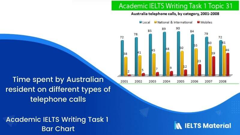
IELTS Academic Writing Task 1 Topic 31: Number of minutes of telephone calls in Australia – Bar Chart
The bar chart below shows the total number of minutes (in billions) of telephone calls in Australia, divided into three categories, from 2001- 2008. Summarise the information by selecting and reporting the main features and make comparisons where relevant.Write at least 150 words. Report Plan Paraphrase: shows>depicts; total number of minutes of telephone calls>varying types of telephone calls Overview: The given chart shows the time Australian residents spent on varying types of telephone calls between 2001 and 2008. Paragraph 2: (1) compare the number of calls throughout the period. Give figures. Paragraph 3: (1) compare the remaining number of calls...
2 min read
Updated On
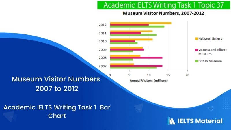
IELTS Academic Writing Task 1 Topic 37: Visitors to three London Museums between 2007 and 2012 – Bar chart
The bar chart shows the number of visitors to three London Museums between 2007 and 2012. Summarize the information by selecting and reporting the main features, and make comparisons where relevant. Write at least 150 words Report Plan Paraphrase: shows>compares; the number of visitors to three London Museums between 2007 and 2012>visitors to three museums in London from the time period of 2007 to 2012 Overview: The bar graph compares visitors to three museums in London from 2007 to 2012. Paragraph 2: (1) compare the data for different museums throughout a period of time. Give figures. Paragraph 3: (1) compare...
2 min read
Updated On

IELTS Academic Writing Task 1 Topic 24 : Hours worked and stress levels amongst professionals in eight groups – Graph
You should spend about 20 minutes on this task.The graphs show figures relating to hours worked and stress levels amongst professionals in eight groups. Describe the information shown to a university or college lecturer.Write at least 150 words Academic IELTS Writing Task 1 Topic 24 Report Plan Paraphrase: show>demarcates; hours worked and stress levels amongst professionals>working hours of eight categories of professionals and the percentages of those dealing with stress-related issues Overview: The given illustration shows the average working hours of eight categories of professionals and the percentages of those dealing with stress-related issues. Paragraph 2: (1) compare the number...
2 min read
Updated On
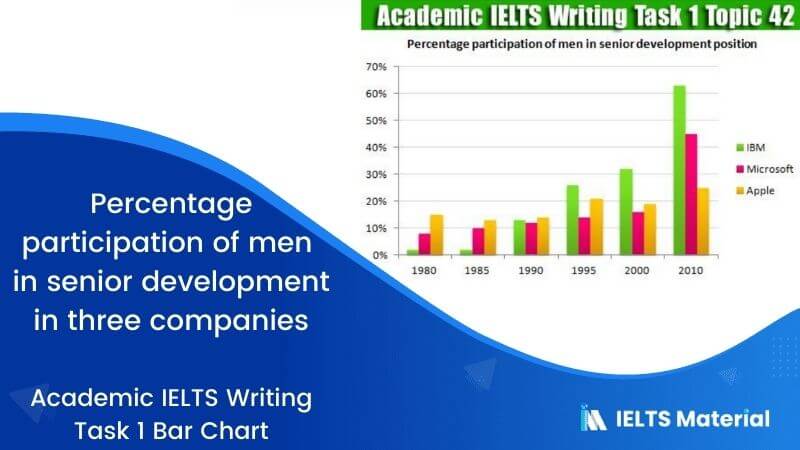
IELTS Academic Writing Task 1 Topic 42: Participation of men in senior development in three companies – Bar Chart
The bar chart below shows the percentage participation of men in senior development in three companies between 1980 and the year 2010. Summarise the information by selecting and report in the main features, and make comparisons where relevant.Write at least 150 words Academic IELTS Writing Task 1 Topic 42 Report Plan Paraphrase: shows>summarises; percentage participation of men>ratio of senior make developers Overview: The graph summarises the ratio of senior male developers between 1980 and 2010 in three different tech companies. Paragraph 2: (1) compare the number of employees in different companies. Give figures. Sample Answer The graph summarises how the...
2 min read
Updated On
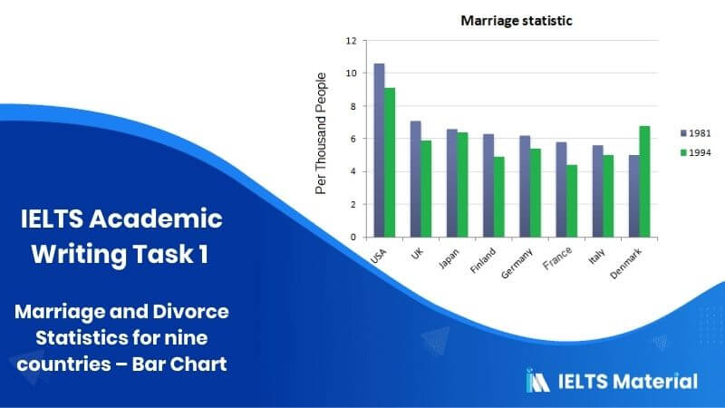
IELTS Academic Writing Task 1 Topic 04: Marriage and Divorce Statistics for eight countries – Bar chart
The bar charts below show the Marriage and Divorce Statistics for eight countries in 1981 and 1994.Write a short report for a university lecturer describing the information shown below. Write at least 150 words. Report Plan Paraphrase: show>representing; marriage and Divorce Statistics for eight countries>the total number of marriages and divorces in eight varying countries Overview: The bar graph is representing the total number of marriages and divorces in eight countries from 1981 and 1994. Paragraph 2: (1) compare the rates in different countries. Give figures. Paragraph 3: (1) compare the rates in remaining countries. Give figures. Paragraph 4: (1)...
2 min read
Updated On

IELTS Academic Writing Task 1 Topic 03: Production of the world’s oil in OPEC and non-OPEC countries – Bar chart
You should spend about 20 minutes on this task.The bar chart below shows the production of the world’s oil in OPEC and non-OPEC countries. Write a short report for a university lecturer describing the information shown below.Write at least 150 words. Report Plan Paraphrase: shows>offering the data overview of; production of the world’s oil in OPEC and non-OPEC countries>production of oil in OPEC and non-OPEC countries across the world Overview: The graph offers data overview of past, present and future production of oil in OPEC and non-OPEC countries. Paragraph 2: (1) Talk about the conditions between the time period of...
2 min read
Updated On

