IELTS Academic Writing Task 1 Topic 18: Average Consumption of food in the world – Pie Chart
The recent recent IELTS writing task 1 topics academic with answers on the pie chart questions on Average Consumption of food in the world will help provide an insight into the writing structure. Level up your preparation and get the desired band scores!
Table of Contents

Try AI Essay Checker for Instant Band Score
In IELTS Academic Writing Task 1, you are required to attempt questions such as a pie chart like "Average Consumption of food in the world". Through the Recent IELTS writing task 1 topics academic with answers, you would be able to immerse yourself into the structure needed to ace the IELTS exam.
Write a report to a university lecturer describing the data.
Write at least 150 words.
Report Plan
Paraphrase: shows>are depicting; average consumption of food in the world>the consumption of four food types across the globe
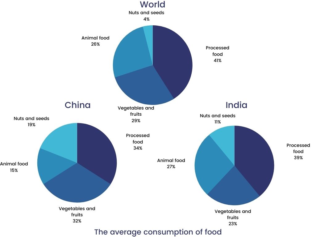
Overview: The graphs illustrate the consumption of 4 types of food used in the world in 2008.
Paragraph 2: (1) Give an overview of the two nations’ food consumption habits.
Paragraph 3: (1) Talk about the food consumption in the world. Give figures.
Paragraph 4: (1) Compare the food consumption of China. Give figures.
Paragraph 5: (1) Compare the food consumption of India. Give figures.
Sample Answer
The pie charts are depicting the consumption of four food types across the globe in 2008. The figures show a comparison of the amounts of food used in China and India in the same year.
Overall, the two nations presented dissimilar patterns of food consumption as compared to the average of the world. Out of all, processed food consumption had the largest shares of percentages in all the three charts.
Particularly, the consumption of processed food was the highest in the world, accounting for 41%, followed by vegetables and fruits at 29% and animal food at a quarter. The consumption of nuts and seeds only consisted 4%.
Similarly, China consumed 39% of the processed food, making it the one with the largest proportion. Animal food exhibited an identical figure, which is similar to the world’s average of 25%. Vegetables and fruits were used at 23%, while nuts and seeds showed less than a half figure.
In India, both vegetable and processed food were used the most in 2008 with 34% and 32% respectively. Nuts and seeds used in this country showed the largest proportion among the three given charts, making up 19%.
Get evaluated for FREE!
Got a quick report in your mind for this question. Don’t hesitate to post the same in our comment section. We will evaluate the report/letter and email you the band score & our trainer’s comments. And, this service is entirely free.
Also check:
- IELTS Writing Task 1
- IELTS Writing task 1 Pie chart
- IELTS Bar chart
- IELTS Table chart
- IELTS Writing task 1 line graph
- IELTS Writing task 1 Map
- IELTS Writing task 1 tips
- IELTS Writing tips
- IELTS Writing recent actual test
- IELTS Writing Answer sheet
- IELTS map vocabulary
- IELTS Writing Task 1 Connectors
Practice IELTS Writing Task 1 based on report types

Start Preparing for IELTS: Get Your 10-Day Study Plan Today!

Recent Articles

Nehasri Ravishenbagam


Nehasri Ravishenbagam
Kasturika Samanta


Post your Comments
2 Comments