IELTS Academic Writing Task 1 Topic 21: Proportion of different categories of families living in poverty in UK – Pie Chart
Table of Contents

Try AI Essay Checker for Instant Band Score
Summarise the information by selecting and reporting the main features, and make comparisons where relevant.
Write at least 150 words.
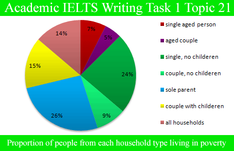
Proportion of people from each household type living in poverty
Report Plan
Paraphrase: shows>inspects; proportion of different categories of families living in poverty in the UK >the different family types living in poor conditions in the UK
Overview: The pie chart examines the different type of families who were living in poor conditions in UK in the year 2002.
Paragraph 2: (1) Compare different categories. Give figures.
Paragraph 3: (1) Compare different categories. Give figures.
Sample Answer
The pie chart inspects the different family types living in poor conditions in the UK in 2002.
At a glance, in the given year, 14% of the entire households in the country were in circumstances of poverty. In comparison to the couples, singles struggled more. Talking about people with children, single parents presented the maximum percentage of 26% amongst all the specified categories, whereas couples with children reported a comparatively lesser percentage of 15%.
As far as the people with no children are concerned, single people were of the hefty percentage, 24%, almost the same number for single people with children. On the contrary, merely 9% of the couples without any children agonized from poverty in 2002. Coming to aged people, singles had a somewhat higher percentage in comparison to couples. Only 7% and 5% of the aged population had difficulties in their living conditions.
Get evaluated for FREE!
Got a quick report in your mind for this question. Don’t hesitate to post the same in our comment section. We will evaluate the report/letter and email you the band score & our trainer’s comments. And, this service is entirely free.
Also check:
- IELTS Writing Task 1
- IELTS Pie chart
- IELTS Bar chart
- IELTS Table chart
- IELTS Writing task 1 line graph
- IELTS Writing task 1 Map
- IELTS Writing task 1 tips
- IELTS Writing tips
- IELTS United Kingdom / IELTS UK
- IELTS Writing recent actual test
- IELTS Writing Answer sheet
- IELTS map vocabulary
- IELTS Writing Task 1 Connectors
Practice IELTS Writing Task 1 based on report types

Start Preparing for IELTS: Get Your 10-Day Study Plan Today!

Explore other sample Pie Charts


Recent Articles

Nehasri Ravishenbagam


Nehasri Ravishenbagam

Kasturika Samanta


Post your Comments
2 Comments