Methods of Transportation for People Traveling to a University – Pie Chart
Limited-Time Offer : Access a FREE 10-Day IELTS Study Plan!
Methods of Transportation for People Traveling to a University
This Writing section task type will assess your reading comprehension as well as your writing abilities. To attempt this type of question, you must get used to quickly scanning the given reference material for relevant information. Study the sample answers below to understand how to approach this task type to ensure correct answers.
We have provided an informative chart on which you can analyze and write a paragraph on. It will help you get a good band score in IELTS Writing Task 1. It is important for you to study the chart and understand it as quickly as possible which will help you to write a descriptive answer.
In Writing task 1 (academic paper) you will have 20 min to write a full report:
- Bar chart
- Diagram or process
- Line graph
- Pie chart
- Table
- Map
- Combination of the above-mentioned topics
Use the sample practice material to develop your IELTS Writing Task 1.
IELTS Writing Task 1
Report Plan
Paraphrase: depicts; Transportation modes used by people to travel to university for work or study purposes in 2004 and 2009. Overview/Summary: 1) decrease in the proportion of car travelers from 2004 to 2009. 2) Upward trend in other modes of transportation.
Paragraph 3: Give figures for Car travelers, bicyclists, pedestrians in 2004.
Paragraph 4: Introduction of the new bus stop; alterations at the car parking area. Give figures.
Paragraph 5: Significant increase in the ratio of bicyclists, train passengers, and pedestrians. Give figures.
Sample Answer
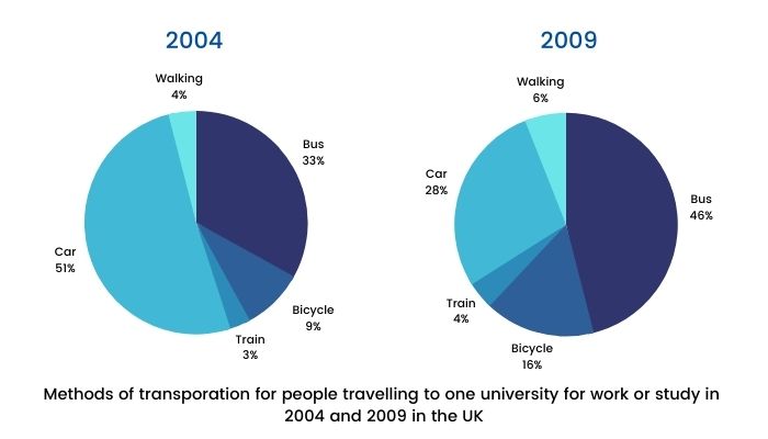
The pie charts depict the proportion of travelers using five different modes of transportation to commute to a university for work and study purposes in 2004 and 2009.
We can observe from the pie-charts that the ratio of people commuting by cars significantly decreased from the year 2004 to 2009 while the other modes of transportation witnessed an upward trend.
Over half of the people (51%) in 2004 traveled by car followed by bus which recorded a ratio of 33%. It is apparent that only 9% of people used bicycles to commute to university which was about three times the ratio of commuters who used the train. Meanwhile, 4% of the people preferred to walk to go to the university.
The proportion of bus-based travelers rose significantly by 13% as a new bus stop was introduced at the university in 2006. Further, some modifications were made to the car parking in 2008 at the university which led to the ratio of car travelers dwindled to 28%.
In contrast, the percentage of bicyclists witnessed a substantial rise by 7% along with the train passengers and pedestrians proportion which followed an upward trend to 4% and 6% respectively.
Get evaluated for FREE!
Got a quick report in your mind for this question. Don’t hesitate to post the same in our comment section. We will evaluate the report/letter and email you the band score & our trainer’s comments. And, this service is entirely free.
See also:
Practice IELTS Writing Task 1 based on report types
Start Preparing for IELTS: Get Your 10-Day Study Plan Today!
Explore other sample Pie Charts
Janice Thompson
Recent Articles
Raajdeep Saha
Kasturika Samanta
Kasturika Samanta
Post your Comments
15 Comments
Karna
Posted on Dec 14, 2023
The two pie charts provide the percentage of different methods of transportation used by people traveling to a university for work or study purposes during the period between 2004 and 2009.
According to the first pie chart, in 2004, the percentage of people who depended on the bus for traveling was 33%. The largest proportion of people used cars at 51%. However, the percentage of people who used a bicycle and a foot was 9% and 4%respectively. The least proportion of people(3%) used trains for their commutation.
As per the second pie chart, in 2009, due to the relocation of a bus stop at university from 2006, a larger proportion of people(46%) used a bus for their commutation. Interestingly, people who depend on the bicycle and by foot increased by 16% and 6%. Whereas the number of people who use cars was reduced dramatically to 28% due to car parking changes at university. The use of trains remained the same at 4%.
Overall, the use of buses increased dramatically, and the car was reduced to a lesser percentage as a commutation method during the given time period.
Reply
IELTS Expert
Posted on Dec 14, 2023
Overall Band: 5
Key features which are selected are not adequately covered. The recounting of detail is mainly mechanical. Although complex sentences are attempted, they tend to be faulty, and the greatest accuracy is achieved on simple sentences.
For a detailed evaluation on IELTS WRITING, Avail a FREE WRITING DEMO with Our Band 9 Expert here.
Do
Posted on Dec 6, 2023
The graph illustrates the key methods of transportation for people travelling to a university for work or study in two years, 2004 and 2009.
At a first glance, there was an increase in every transportation for people travelling to one university for work or study. Aside from it, there’s still an exception for car, dropped a decent amount of proportion.
Car was the most popular method to use for transportation in 2004, however, dropped from a half to just below the third (28%) in 2009. On the other hand, bus comprised of the second method for travelling to work, 33% in 2004, this, then with a 10% increase replaced the old champion in 2009.
In 2004 approximately a half was car, whereas in 2009 this had to fallen to just over a quarter.
Train is the least choice in most people’s means which is 3%, however, if combined it with Bicycle, it is 3 times higher than walking alone. The increasing got even further, 4 times higher than walking (6%), with the total proportion of train and bicycle, 4, and 6 percent respectively.
Reply
IELTS Expert
Posted on Dec 7, 2023
Overall Band: 5
Key features which are selected are not adequately covered. The recounting of detail is mainly mechanical. Although complex sentences are attempted, they tend to be faulty, and the greatest accuracy is achieved on simple sentences.
For a detailed evaluation on IELTS WRITING, Avail a FREE WRITING DEMO with Our Band 9 Expert here.
Marzia-afrin
Posted on Nov 15, 2023
The pie charts provide infomation about how transporation modes used by prople for traveelingg to one university for work or study between 2004 and 2009 in the UK.
Overall, at the beggining of the period people used to travel by train the least of UK, while cars was the most significant way for commuting.In coparison, at the end of the period bus holds the largest ratio for people traveeling and the lowest proportion was made by train.
in 2004 just above the half of the prople travel by card and just a third used bus, whereas other vehicles like 9% used bicyle and only 3% people used train and a very small drop of pupils prefered to walk.
Car which plays significant role in 2004, it decrease 51% to 2% in 2009, bus holds the higest part which was only 33% earlier. The proportion of travelers by bicycle increased in 2009 from 9% to 16%. Further, a tiny portion increase in train lover prople which was 3%earlier and became 4% in 2009 of UK. People love to walk meanwhile it increased from 4% to 6% from the period of time.
Reply
IELTS Expert
Posted on Nov 16, 2023
Overall Band : 4
There are many spelling errors in the answer written, hence the user needs to work on the spellings; furthermore, the vocabulary used is simple and repetitive. User has used only simple sentences, thus a variation in the range of the sentences is required to achieve higher band scores.
To get the details for IELTS Writing, you can avail a FREE DEMO CLASS with a BAND 9 Expert Trainer.
Ashkan
Posted on Oct 17, 2023
The bar charts compare primary ways that people use for heading to a college weather for work or study in 2004 and 2009 in the United Kingdom.
It’s noticeable that the biggest proportion of people’s choice was car in 2004, while it had been shifted to the bus by 2009. In contrast, walking and using train were both used a negligible percentage in both years in this country.
In 2004, the most transportation method that people were using for going to universities was car by 51%, while it decreased to 28% in 2009. In contrast, usage of bus significantly increased from 33% to 46% in these two years in the UK.
People didn’t use trains or go by their feet too much in 2004 for transportation, figures indicates that they had 3% and 4% respectively which had approximately remained in the same level by 2009. Using of bicycles saw a 5% increase in 2009 which showed a 16% in compare of its previous number which was 9%.
Reply
IELTS Expert
Posted on Nov 29, 2023
Overall Band: 5
Key features which are selected are not adequately covered. The recounting of detail is mainly mechanical.There is a limited use of cohesive devices with some inaccuracy.Simple vocabulary is used accurately but the range does not permit much variation in expression.
To get a detailed Evaluation, Connect with our BAND 9 Expert and Avail the IELTS Writing Tips FREE.
Vaidehi
Posted on May 27, 2022
The given pie chart depicts various ways in which people commute to a particular university in two years, 2004 and 2009.
Overall, it can be inferred that in 2004, majority of the persons travelled from car whereas in 2009, the preference shifted to bus. In both the years, least used transport was train.
In 2004, almost half of people went to the university by car, this was followed by bus accounting for 33% of the students or the workers. Other methods which include; going by bicycle, train or a walk comprised 9, 3 and 4 percentages of persons respectively.
However, in 2009, travelling by bus was the most convenient method and was used by slightly less than half of the population. Proportion of people travelling by car plummeted to 28% while the usage of bicycle increased by 7%. The remaining 10% used either a train or simply walked to their university.
Reply
Glen Brown
Posted on May 30, 2022
Band Score: 5
Use articles and prepositions correctly
Use punctuation wherever necessary
youmna hatem
Posted on May 10, 2022
These two pie diagrams show the types of transportation used by students, employees, or general people heading to their work place, colleges, and other educational purposes. The computations are observed in 2004 and 2009 in the United Kingdom.
In general, it could be conducted that vehicles like buses and bicycles seem to have a modest increase through the five year period in comparison with walking and using the train that increased very slightly. On the other hand, people driving cars had a sharp plummet through out the years.
Starting in 2004 people used to transport by cars more than any other transportation method that it took off 51 percent of the total diagram, nevertheless car drivers/riders declined sharply as we see a 23% dramatic decrease in 2009. Moreover, train usage and walking was not very likeable back in 2004, 4% preferred walking and only 3% took the train. In fact, it is shown that in 2009 people did not prefer walking or taking the train either, because of the insignificant increase that is around 1 to 2 % for each.
Conversely, using the bus or riding a bicycle is determined to appeal more people as there is a high increase in both from 2004 to 2009. Bus takers increased around 13% as it was only biased by 33% of the UK’s population in 2004, but increased to 46% by 2009. Riding bicycles seemed to attract more people through the years to be grown from a 9% usage in 2004 to 16% in 2009.
Reply
Glen Brown
Posted on May 11, 2022
Band Score: 5
The word count is more than the limit of 150 – 175 words
Concentrate on spellings
Use correct verb tense and preposition
Use punctuation wherever necessary
Ari
Posted on Feb 24, 2020
Hi, I’m just confused where is exactly the year of 1994 that you mentioned on your answer? I did not find it on the question
Reply
Zuhana
Posted on Aug 3, 2020
Hi, the answer has been updated.
Đào Ngọc Tân
Posted on Dec 14, 2018
Hi IELTS Material,
My IELTS Writing score is : 4.5, so can i use this model answer for me?
Reply