The graph below gives information from a 2008 report about the consumption of energy - IELTS Writing Task 1
6 min read
Updated On
-
Copy link
Examine the outline and sample responses for ‘The graph below gives information from a 2008 report about the consumption of energy’ to master and approach them confidently on IELTS Writing Task 1 and learn to describe data to improve your writing score.
Table of Contents
- Question for The graph below gives information from a 2008 report about the consumption of energy - IELTS Academic Writing Task 1
- Outline for IELTS Writing Task 1 Line Chart
- Sample Answers on ‘The graph below gives information from a 2008 report about the consumption of energy'
- Tips for IELTS Writing Task 1 Line Graph - The graph below gives information from a 2008 report about the consumption of energy

Try AI Essay Checker for Instant Band Score
The line graph ‘The graph below gives information from a 2008 report about the consumption of energy’ summarizes data from a 2008 report illustrating how different fuel sources have been used in the USA over a 50-year period, including future projections. Understanding how to identify dominant trends, stable patterns, and projected shifts is essential for producing a Band 8+ IELTS Writing Task 1 response.
In this blog, we will look at how to approach an IELTS Academic Writing Task 1 question based on a line graph, three sample answers to 'The graph below gives information from a 2008 report about energy consumption', and IELTS table chart writing tips.
Question for The graph below gives information from a 2008 report about the consumption of energy - IELTS Academic Writing Task 1
You should spend about 20 minutes on this task.
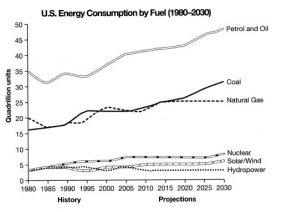
The graph below gives information from a 2008 report about the consumption of energy in the USA since 1980 with projections until 2030. Summarise the information by selecting and reporting the main features, and make comparisons where relevant.
You should write at least 150 words.
Outline for IELTS Writing Task 1 Line Chart
Given below is a detailed structure that will assist you in organizing your answer for IELTS Writing Task 1 - Line Graph, like ‘The graph below gives information from a 2008 report about the consumption of energy’.
|
Introduction
Overview
Body Paragraph 1
Body Paragraph 2
|
Need expert advice on tackling IELTS line charts?
Book a free trial & talk to our experts NOW!
Sample Answers on ‘The graph below gives information from a 2008 report about the consumption of energy'
Now, take a look at the sample answers for 'The table below shows the percentage of the population by age groups' for various IELTS band scores, which will help you frame your responses clearly.
The graph below gives information from a 2008 report about the consumption of energy - Sample Answer 1
The graph represents the consumption of different forms of energy by the United States of America from the year 1980 and also the possible levels of consumption till the year 2030.
It is quite evident that energy produced from fossil fuels like coal, natural gas, and petroleum is dominant, whereas alternative energy sources like solar power, wind power, hydropower, and nuclear power are least utilized.
Petrol and oil resources were the highest energy suppliers in the USA, where the consumption was mostly upwards rising, and levels are expected to rise in the future. Coal and natural gas had relatively lower consumption levels than petroleum. The use of these resources also rose over the years, and consumption is expected to rise. The use of natural gas became stagnant after 2015.
Renewable energy use was significantly less, but consumption had increased overall. The utilization of renewable energy remained constant after 2010, with nuclear and solar/wind power use rising slightly around 2025.
Book free IELTS online classes to discuss your writing queries with our IELTS expert!
The graph below gives information from a 2008 report about the consumption of energy - Sample Answer 2
The graph provides information about energy consumption in the USA from 1980 to 2030, including future projections. The figures are given in quadrillion units.
Overall, it is evident that fossil fuels dominate energy usage throughout the period. Petrol and oil remain the most widely used sources, while coal is projected to rise steadily. By contrast, renewable sources like nuclear power, solar and wind energy, and hydropower contribute comparatively little.
Petrol and oil consumption began at around 35 quadrillion units in 1980 and experienced some fluctuation before increasing significantly to nearly 50 units by 2030. Coal usage showed gradual growth from about 16 units and is forecast to reach approximately 30 units. Natural gas, however, fluctuated around the 20-unit mark and is expected to remain stable.
In contrast, among the remaining sources, nuclear energy increased slowly over time. Solar and wind energy also rose slightly, whereas hydropower consumption remained almost constant throughout the period.
Access the latest IELTS Writing Task 1 line graphs with our IELTS Writing Task 1 Academic Course!
The graph below gives information from a 2008 report about the consumption of energy - Sample Answer 3
The line graph illustrates the amount of energy consumed in the United States from six different sources between 1980 and 2030, measured in quadrillion units.
Broadly speaking, petrol and oil consistently account for the highest proportion of energy consumption throughout the period. Coal usage shows a steady upward trend and is expected to increase further, while natural gas remains relatively stable. In contrast, nuclear power, solar and wind energy, and hydropower contribute significantly smaller amounts.
In 1980, petrol and oil consumption stood at approximately 35 quadrillion units, far exceeding other sources. Despite minor fluctuations, this figure rose steadily and is projected to reach nearly 50 quadrillion units by 2030. Coal consumption started at roughly 16 quadrillion units and is expected to climb considerably, overtaking natural gas by the end of the period. Natural gas began at around 20 quadrillion units and fluctuated moderately before stabilizing at just above 20 units.
Regarding alternative sources, nuclear energy experienced gradual growth from about 4 to approximately 7 quadrillion units. Solar and wind energy showed a modest but consistent increase, whereas hydropower remained largely unchanged over the entire timeframe.
Want extensive materials to get ready for the IELTS Academic Writing Task 1?
Check out IELTS Writing Task 1 (Academic) Actual Tests with Answers!
Tips for IELTS Writing Task 1 Line Graph - The graph below gives information from a 2008 report about the consumption of energy
To achieve a Band 9 score on ‘The graph below gives information from a 2008 report about the consumption of energy’ line graph, you must go beyond simply describing figures. Let us check out some IELTS exam preparation tips for band score of 8+ in similar IELTS table graphs.
- Group energy sources logically: Since three sources are fossil fuels and three are alternatives, grouping them allows you to compare dominance versus minor contribution. If you describe each line individually, your response becomes mechanical and repetitive. Examiners reward analytical grouping because it demonstrates an ability to organise data logically rather than simply listing trends.
- Highlight projections clearly: Use future-focused language such as ‘is projected to’, ‘is expected to’ or ‘is forecast to’. Writing “coal increased to 30 in 2030” is inaccurate because that data has not yet happened. Using correct projection language shows grammatical control and task awareness, both essential for Band 8+.
- Use trend vocabulary accurately: Instead of basic verbs like ‘go up’ ‘stayed the same’ or ‘went up and down’, use precise academic alternatives like ‘increased steadily’, ‘remained stable’ and ‘fluctuated’, along with appropriate IELTS Writing Task 1 connectors. However, vocabulary must match the data. For example, natural gas does not rise dramatically, it fluctuates within a narrow range. Using ‘soared’ or ‘plummeted’ would reduce your score because exaggeration signals poor data interpretation.
- Mention units once only: Write “measured in quadrillion units” in the introduction only. Repeating the unit in every sentence makes the report sound unnatural and overly mechanical. After mentioning it once, you can simply state numbers. This improves cohesion and keeps your writing concise and academic.
- Overview must mention key global features: The overview is the most important paragraph for Task Achievement. It must summarise the essential trends without numbers. If you miss coal’s strong projected growth or the dominance of fossil fuels, you risk falling below Band 7.
To conclude, achieving a Band 8+ in the Academic Writing Task 1 depends on clearly identifying overall trends, grouping related energy sources effectively, and accurately distinguishing between historical data and future projections. By focusing on comparisons rather than isolated figures and maintaining precise academic language, you can produce a coherent, well-structured, and high-scoring Task 1 response. So, start practicing recent IELTS Writing Task 1 topics academic with model answers and improve your writing skills.
Useful Links:
- Different Sources of Air Pollutants in the UK - IELTS Academic Writing Task 1 Line Graph
- IELTS Academic Writing Task 1 – Shops that Closed With
- The Percentage of Female Members of Parliament in 5 European Countries - IELTS Academic Writing Task 1 (Line Graph)
- The Changes In Ownership Of Electrical Appliances And Amount Of Time Spent Doing Housework In Households - IELTS Writing Task 1
- IELTS Writing Task 1 Line Graph Vocabulary
- Visuals: Writing About Graphs, Tables and Diagrams for IELTS Writing Task 1 (Ebook)
Practice IELTS Writing Task 1 based on report types

Start Preparing for IELTS: Get Your 10-Day Study Plan Today!

Explore other sample Line Graphs


Nehasri Ravishenbagam
Recent Articles

Nehasri Ravishenbagam


Nehasri Ravishenbagam

Kasturika Samanta


Post your Comments