IELTS Academic Writing Task 1 Topic 41: Employment patterns in the USA – Line Graph


Limited-Time Offer : Access a FREE 10-Day IELTS Study Plan!
Summarise the information by selecting and report in the main features, and make comparisons where relevant.
Write at least 150 words.
Report Plan
Paraphrase: presents>represents; employment patterns in the USA >patterns of employment in America
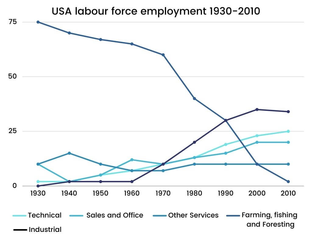
Overview: The given graph represents the patterns of employment in America between the time period of 1930 and 2010.
Paragraph 2: (1) Talk about the employment patterns in different sectors. Give figures.
Paragraph 3: (1) Talk about the employment patterns in different sectors. Give figures.
Paragraph 4: (1) Talk about the employment patterns in different sectors. Give figures.
Sample Answer
The given graph represents the patterns of employment in America between the time period of 1930 and 2010.
It is evident that in 1930, 75% of the American labour force got employment in farming, fishing and foresting. On the other hand, merely 10% were employed in sales and office and trade. During this time, the industrial and technical sectors comprised only 2% of the workforce. However, a gradual change can be seen in the situation over the next 20 years, except for the technical workforce as it employed threefold people.
Also, by the time 1980 entered, the American employment pattern had undergone a substantial change. While the number of employees in farming, fishing and foresting had declined to 40%, industrial and technical employees saw an upsurge to 13% and 10% respectively.
Likewise, the sales and office sectors didn’t increase until 1980. The most significant change can be seen in 2000 when the proportions of farming, fishing and foresting decreased to 1% while the other three significant sectors increased to more than 20% of the employment.
Get evaluated for FREE!
Got a quick report in your mind for this question. Don’t hesitate to post the same in our comment section. We will evaluate the report/letter and email you the band score & our trainer’s comments. And, this service is entirely free.
Also check:
Practice IELTS Writing Task 1 based on report types

Start Preparing for IELTS: Get Your 10-Day Study Plan Today!

Explore other sample Line Graphs

Nehasri Ravishenbagam

Janice Thompson


Recent Articles

Nehasri Ravishenbagam


Nehasri Ravishenbagam


Post your Comments
3 Comments
Nafis
Posted on Dec 26, 2023
The line graph gives information about the patterns of worker in the USA from 1930 to 2010.
Overall, the figure of industrial had an upward trend. However, the figure of farming saw a downward trend.
In the first year, the graph of industrial increased to 75 employment. The figures of sales and office and other services had an increase to 15 employment. The graph of technical had approximately 2 worker and the figure of farming did not change.
Between 1930 and 2010, there was a peak of industrial by 75 employment. However, in 2010, industrial fell to 2 worker. In addition, the figure of farming had a rise trend from 0 to 30 employment. Likewise, the figures of sales and office with other services had not any great growth and they had a stable trends. For 80 years, the graph of technical had a tiny rise to 25 job in 2010.
Reply
IELTS Expert
Posted on Dec 27, 2023
Overall Band: 4
Some structures are produced accurately but grammatical errors are frequent and impede meaning.
Punctuation is often faulty or inadequate. Inappropriate word choice and errors in word formation impede meaning.
To get more details on IELTS WRITING, Unlock a FREE SESSION with Our Band 9 Expert here and Avail the BAND 9 Sample answers too.
sonia
Posted on Jan 11, 2022
Question: The chart shows the unemployment situation in Australia in the year 2012. Write at least 150 words?
The chart provides information about the percentages of unemployment in rural and urban areas of Australia in the year 2012.
Overall, Rural areas of Australia experienced a downward trend, while its urban areas showed an upward trend throughout the year. Both areas had some fluctuations.
Rural areas rate was about 6.5% at beginning of the year, being higher than the rate of urban areas of Australia. Then it showed a gradual decrease to about 4.5% in the second quarter of the year and continued to rise to about 5.5% and then decline to 5% in the third quarter of the year and hitting a low point of 5% at the end of the year.
Percentage of urban areas was about 2.2% at the beginning of the year and then it rose to 4% and then continued to decline to almost 2% in between the second and the third quarter of the year. It continued to rise steadily and reach to almost 5% at the end of the year.
Reply