The charts below give information about USA marriage and divorce rates between 1970 and 2000 - IELTS Writing Task 1
5 min read
Updated On
-
Copy link
Learn to describe data to improve your writing score by studying the outline and sample answers for ‘The charts below give information about USA marriage and divorce rates between 1970 and 2000’ & confidently approach them on IELTS Academic Task 1.
Table of Contents

Try AI Essay Checker for Instant Band Score
Changes in marriage patterns often reflect wider social, economic, and cultural shifts within a society. The set of charts for ‘The charts below give information about USA marriage and divorce rates between 1970 and 2000’ from Cambridge IELTS 6 Test 4 presents trends in marriage and divorce rates in the United States over a thirty-year period, alongside a comparison of adults’ marital status in 1970 and 2000. To achieve a high band score in this mixed-chart task, candidates must identify long-term patterns and connect rate changes with shifts in population distribution.
This blog post will examine three sample responses to the IELTS Academic Writing Task 1 question, ‘The charts below give information about USA marriage and divorce rates between 1970 and 2000’, which is based on a bar graph.
Question for The charts below give information about USA marriage and divorce rates between 1970 and 2000 - IELTS Academic Writing Task 1
You should spend about 20 minutes on this task.
The charts below give information about USA marriage and divorce rates between 1970 and 2000 and the marital status of adult Americans in two of the years. Summarise the information by selecting and reporting the main features, and make comparisons where relevant.
Write at least 150 words.
Outline for IELTS Writing Task 1 Bar Graph
A detailed structure is provided below to help you organize your answer for IELTS bar charts, such as 'The charts below give information about USA marriage and divorce rates between 1970 and 2000'.
|
Paraphrase
Overview
Body Paragraph 1
Body Paragraph 2
|
Book free IELTS online classes to discuss your writing queries with our IELTS expert!
Sample Answers on ‘The charts below give information about USA marriage and divorce rates between 1970 and 2000'
Now, take a look at the sample answers for 'The charts below give information about USA marriage and divorce rates between 1970 and 2000' for various IELTS band scores, which will help you frame your responses clearly.
The charts below give information about USA marriage and divorce rates between 1970 and 2000 - Sample Answer 1
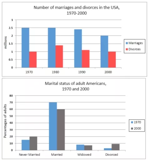
The first bar graph represents the number of marriages and divorces in the USA from 1970 to 2000. The second bar graph shows the marital status of adult Americans in 1970 and 2000.
The number of marriages was higher than the number of divorces every year from 1970 to 2000. Most adult Americans were either married or never had been married in both 1970 and 2000.
The number of marriages was the same in 1970 and 1980 with 2.5 million each year. The number of divorces rose from 1 million in 1970 to almost 1.5 million in 1980. The number of marriages and divorces fell in 1990 and further dropped, in 2000 to 2 million marriages and 1 million divorces.
Most adult Americans were married in both 1970 and 2000, but the percentage of married people dropped in 2000. The remaining majority of adult Americans were either bachelors or bachelorettes in both years. The number of widowed and divorced Americans was below 10% in 1970 and 2000.
Book a FREE Demo to learn tips and writing techniques from experts!
The charts below give information about USA marriage and divorce rates between 1970 and 2000 - Sample Answer 2
The line graph illustrates marriage and divorce rates in the United States between 1970 and 2000, while the pie charts compare the marital status of American adults in 1970 and 2000.
Overall, marriage rates declined steadily over the period, whereas divorce rates rose sharply before experiencing a slight fall. Correspondingly, the proportion of married adults decreased by 2000, while the percentages of divorced and never-married individuals increased.
In 1970, approximately 2.5 million marriages were recorded, compared to about 1 million divorces. Marriage figures then fell gradually to around 2 million by 2000. In contrast, divorce rates climbed to a peak of roughly 1.4 million in 1980 before declining modestly to just over 1 million at the end of the period.
The pie charts reveal that in 1970, about 70% of adults were married, making it the dominant category. By 2000, this figure had fallen to around 60%. Meanwhile, the proportion of divorced adults rose significantly, and the percentage of individuals who had never married also increased. The proportion of widowed adults declined slightly over the thirty-year period.
Want extensive materials to get ready for the IELTS Academic Writing Task 1?
Check out IELTS Writing Task 1 (Academic) Actual Tests with Answers!
The charts below give information about USA marriage and divorce rates between 1970 and 2000 - Sample Answer 3
The given charts present data on marriage and divorce rates in the USA between 1970 and 2000, along with the marital status distribution in 1970 and 2000.
Broadly speaking, the data indicates a gradual decline in marriage rates over the three decades, contrasted with a surge in divorces during the 1970s followed by a moderate downturn. These trends are reflected in the shifting marital composition of the adult population, with fewer married individuals and a greater proportion of divorced or single adults by 2000.
Marriage rates fell gradually from around 10 per 1,000 people in 1970 to about 7 in 2000. In contrast, divorce rates rose significantly during the 1970s, reaching approximately 5 per 1,000 in 1980, before declining slightly to around 4 in 2000.
In 1970, married individuals accounted for the majority at roughly 70%, but this proportion dropped to about 60% in 2000. The percentage of divorced adults rose markedly, and the proportion of those who had never married also increased. The widowed category experienced a minor decrease over the period.
To conclude, a double-chart task like this one highlights the importance of identifying long-term trends, comparing proportions across years, and linking rate changes to demographic outcomes. A well-structured response that separates trend analysis from percentage comparison, while maintaining clear and accurate language, is essential for achieving a Band 8+ score in Writing Task 1. So, start practicing recent IELTS Writing topics with answers and improve your writing skills.
Useful Links:
- Percentage of People Living Alone in 5 Different Age Groups in the USA - IELTS Academic Writing Task 1 (Bar Chart)
- Annual Pay for Doctors and Other Workers - IELTS Writing Task 1 Bar Chart
- IELTS Academic Writing Task 1 Topic : People affected by four types of noise pollution - Bar graph
- Rural Households that Had Internet Access Between 1999 and 2004 - IELTS Bar Graph
- Recent IELTS Writing Task 1 Topics Academic with Model Answers
- IELTS Academic Writing Task 1: Useful Tips and Vocabulary to Describe a Graph or Chart
- Book: Academic Writing Practice for IELTS by Sam McCarter
Practice IELTS Writing Task 1 based on report types

Start Preparing for IELTS: Get Your 10-Day Study Plan Today!

Explore other sample Bar Charts


Recent Articles

Nehasri Ravishenbagam


Nehasri Ravishenbagam

Kasturika Samanta


Post your Comments